Flight Training Adelaide
Leadership / Branding / Research / Design / Photography
FTA
My Role:
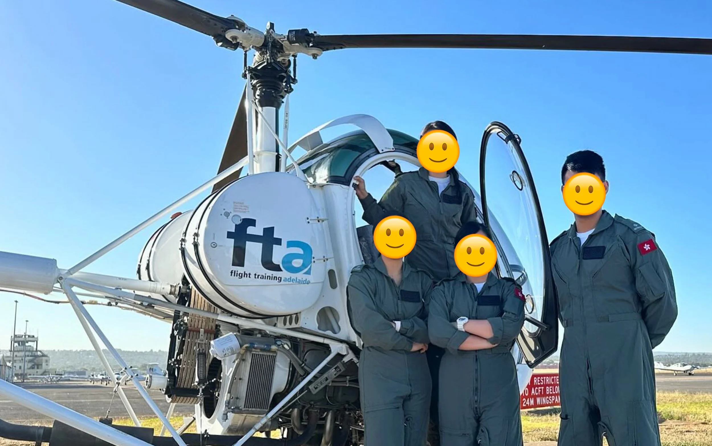
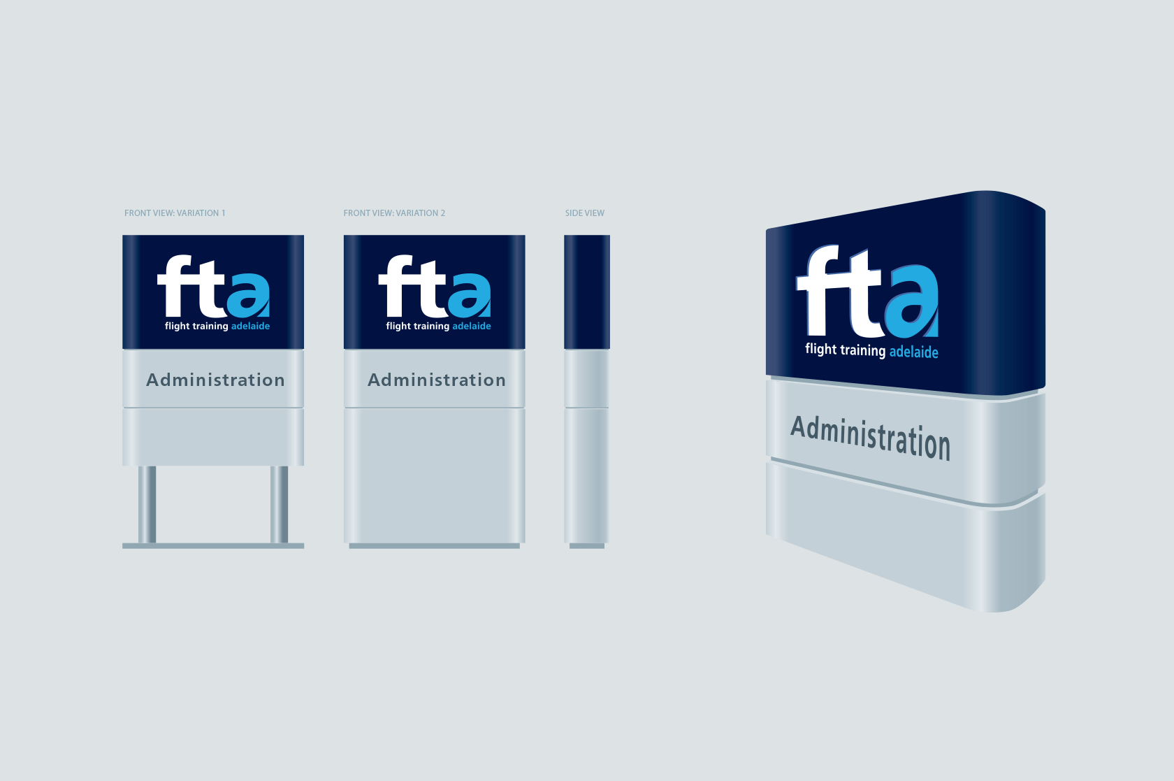
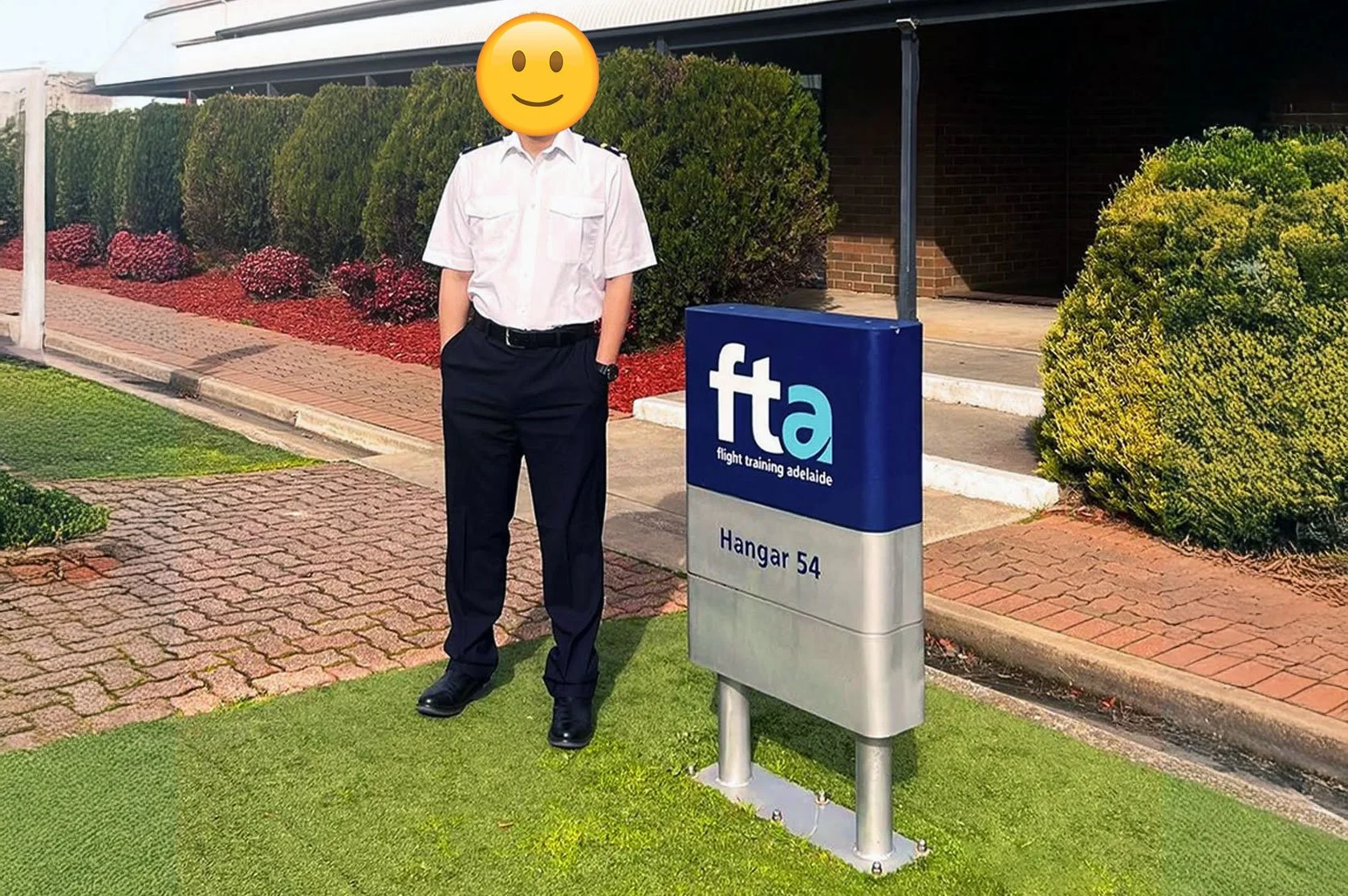
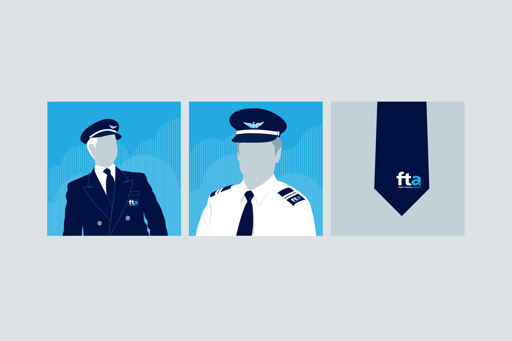
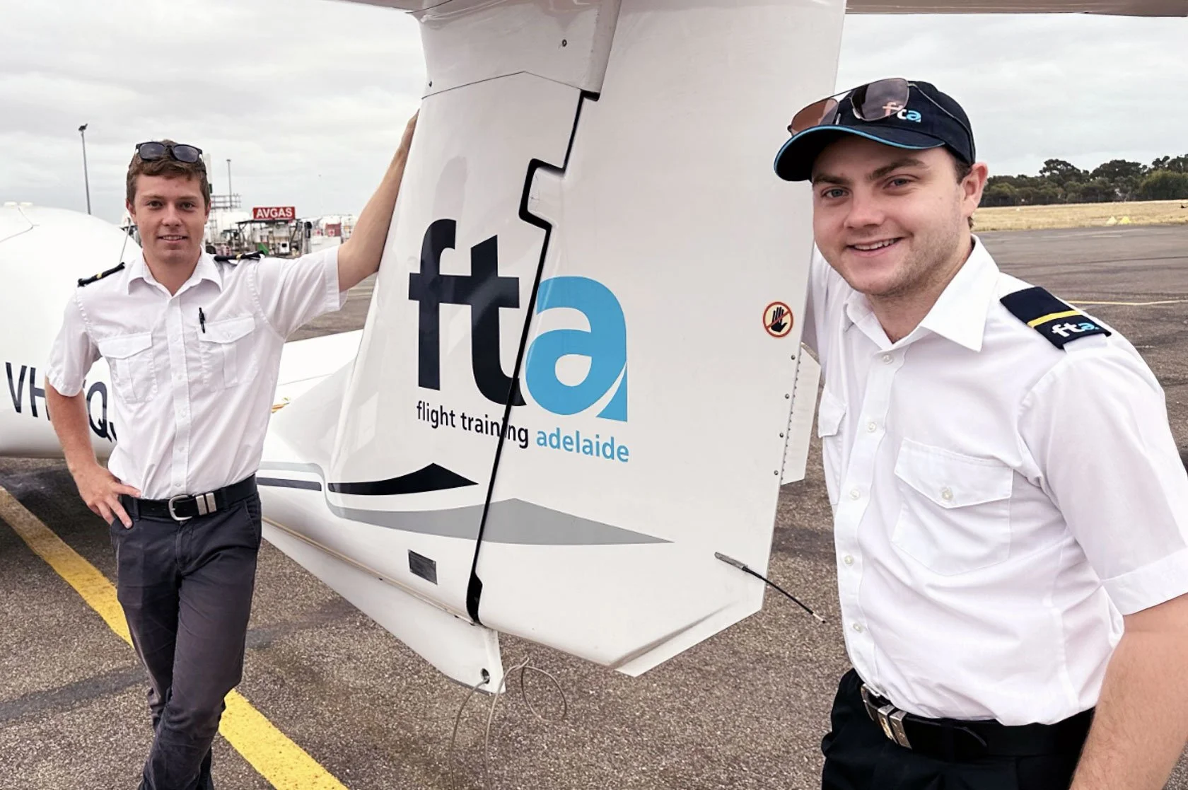
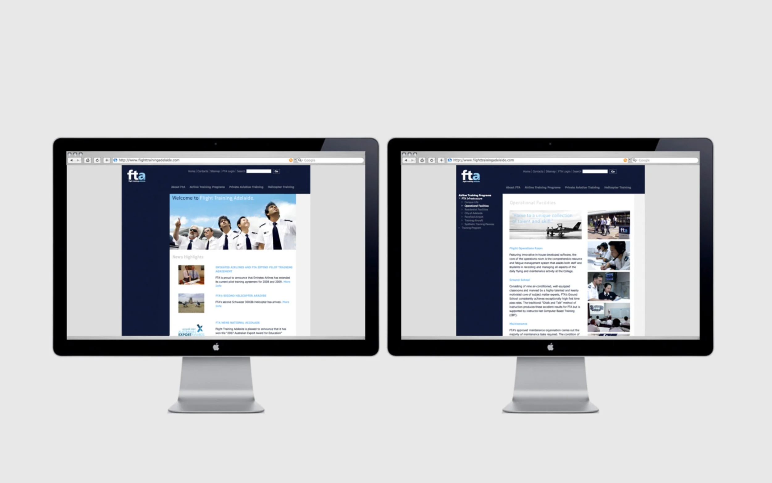
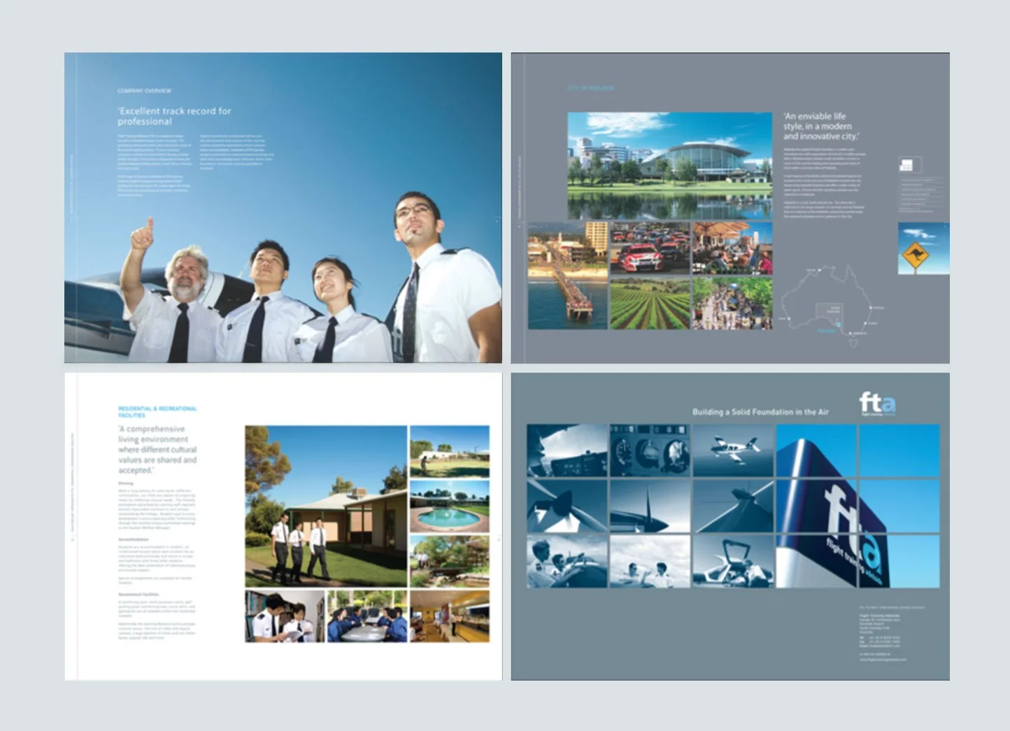
RE:START, a design agency I co-founded, won a rebranding project for Flight Training Adelaide (FTA) after its acquisition. The project spanned Hong Kong and Adelaide, Australia, aiming to create a bold, strong, and dynamic brand to support FTA’s global expansion in aviation training. We engaged with FTA’s management on-site to ensure the new brand was adaptable to diverse market needs. The scope included redesigning all online and offline marketing materials, as well as applying the corporate identity guide across FTA’s fleet, airfield, indoor and outdoor signage, and uniforms for instructors and cadets.
Who is Flight Training Adelaide
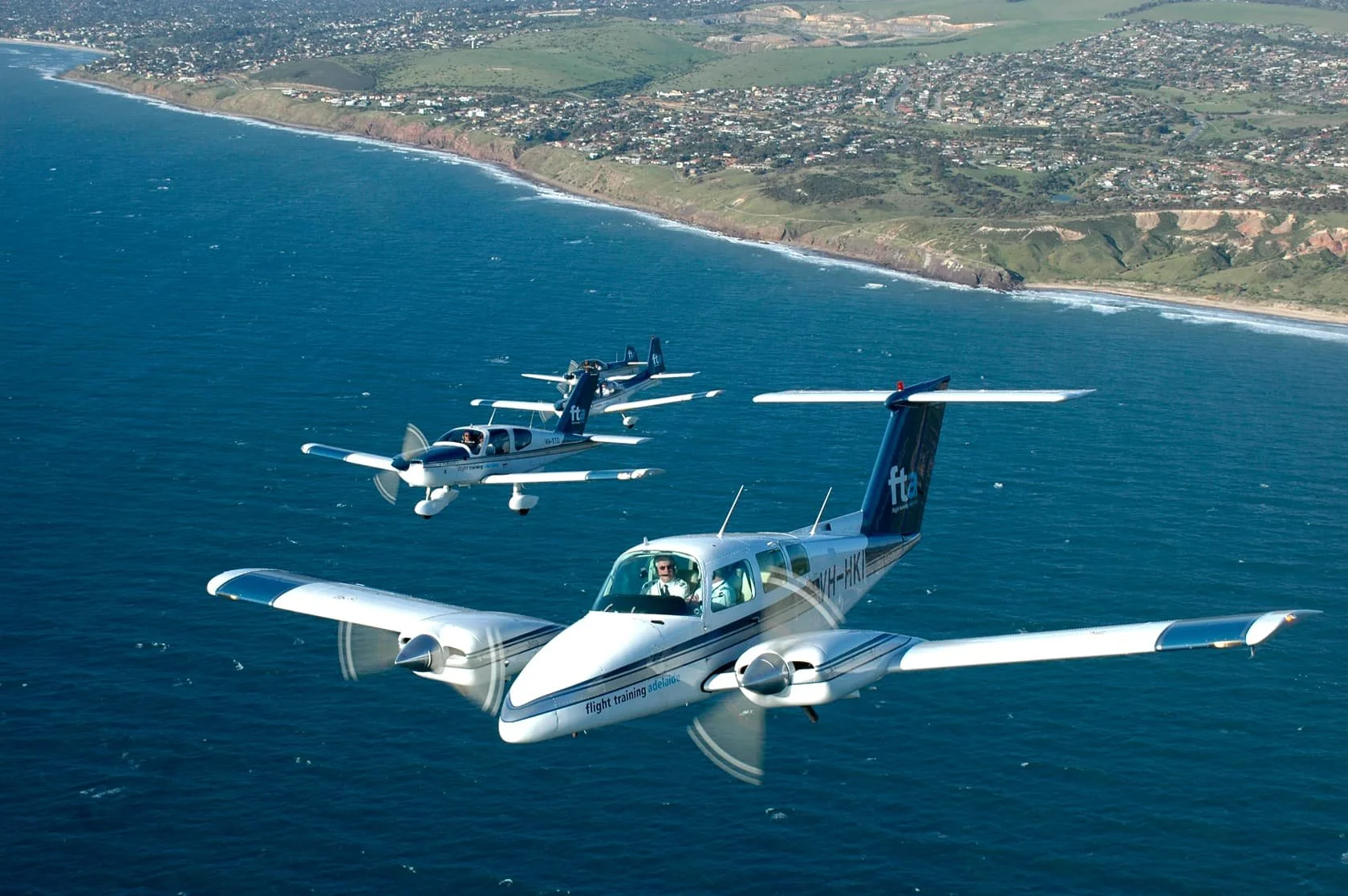
Flight Training Adelaide (FTA) delivers world-class, customized aviation training solutions for fixed-wing and rotary-wing pilots. Focused on producing future airline and helicopter captains, FTA goes beyond basic licensing with significant investments in aircraft, simulators, and infrastructure.
Soar to New Heights with FTA: World-Class Aviation Training Reimagined
Why (The Purpose)
FTA exists to empower the next generation of aviation leaders by delivering world-class training that transforms aspiring pilots into confident, capable airline and helicopter captains. FTA believe in shaping not just skilled aviators but visionary leaders who elevate the aviation industry with safety, expertise, and innovation.
How (The Process)
FTA fulfills its mission through a forward-thinking, captain-focused training approach that emphasizes quality, customization, and innovation. The organization plans to invest significantly in state-of-the-art aircraft, advanced simulators, and modern facilities at Parafield Airport in South Australia. Additionally, they are exploring expansion into different locations to accommodate more clients.
What (The Result)
FTA offers tailored aviation training solutions for fixed-wing and rotary-wing pilots, catering to sponsored cadets and self-funded students. Services include pilot selection, ab initio training, and advanced courses for airline and general aviation, focusing on developing captains rather than just licensed pilots. With state-of-the-art simulators and a modern fleet, FTA aims to exceed industry standards and become an operator worldwide.

FTA Rebrand: Driving continuous improvement, global innovation, and
technological excellence in shaping aviation's future
From Lettering to Legacy: The Origins of FTA’s Visual Identity
Established in 1982, Flight Training Adelaide (FTA) is a leading aviation training provider for 28 major airlines. Despite its prominence, FTA lacks a distinct corporate identity, currently relying on basic lettering that simply states "Flight Training Adelaide." Following a recent acquisition, the new owner seeks to redefine FTA’s brand with a logo that is visually striking, memorable, and reflective of the organization’s core values and mission.
-
The logo should be designed to be bold and eye-catching, as this will enhance brand recognition and help it stand out in the competitive aviation training industry. Focusing on these elements will contribute significantly to its effectiveness.
-
The design should effectively capture the essence of FTA, highlighting its commitment to aviation training and the transformative journey it provides for cadets. This focus will enhance the overall narrative and vision of the organization.
-
The logo should encapsulate the emotional significance of a cadet's "first takeoff," embodying themes of control, empowerment, and the beginning of their aviation journey. This design should inspire a sense of pride and excitement as they embark on their flight training.
-
The design should thoughtfully incorporate elements that highlight Adelaide’s excellent flying conditions, such as its clear skies and stable weather patterns. This will position the area as an outstanding choice for flight training.
-
Given the abundance of flight training schools in Adelaide, it’s essential for the logo to effectively position FTA as an industry leader. The design should emphasize the school’s strong infrastructure and its established reputation for delivering quality training.
Key goals identified through interviews and meetings with the new owner and senior executives include:
The redesigned logo should serve as a powerful symbol of FTA’s legacy, values, and commitment to shaping the next generation of aviators.
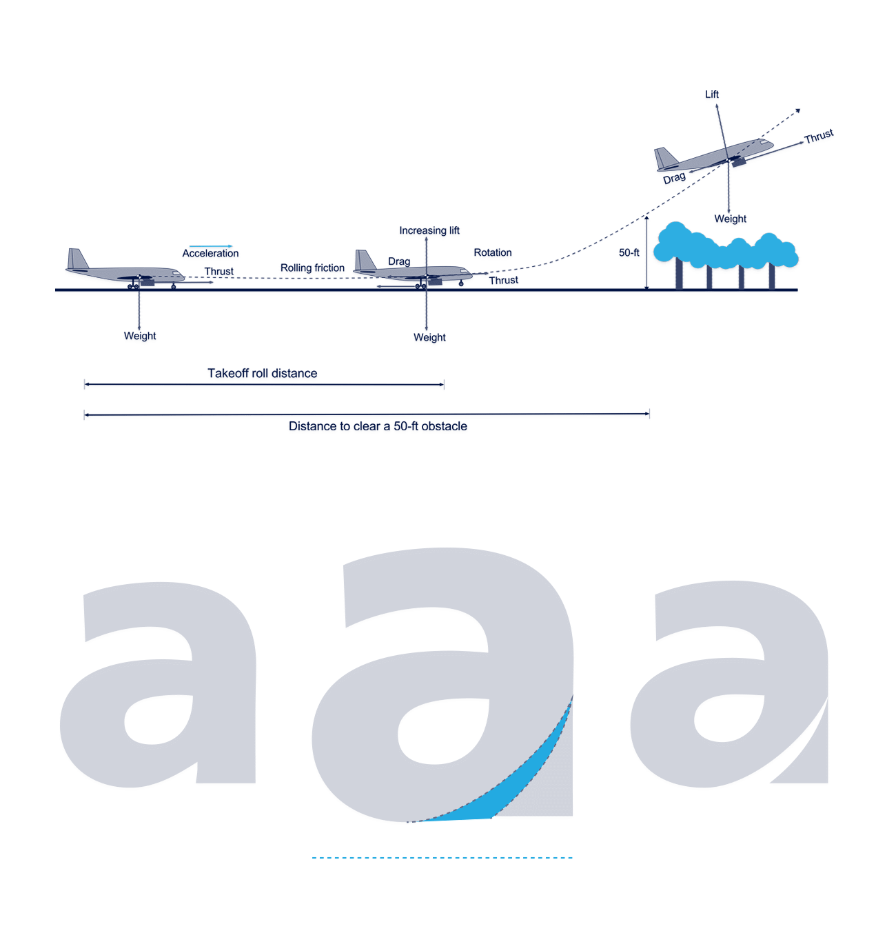
The "first takeoff" refers to a pivotal moment in a pilot's training when a cadet, under the guidance of an instructor, performs their initial takeoff in an aircraft. This is a significant milestone in flight training, as it marks the first time the cadet actively controls the aircraft as it accelerates down the runway, lifts off, and climbs into the sky.
During the first takeoff, the cadet experiences the thrill and responsibility of being in command of the aircraft, managing critical elements like throttle, rudder, and pitch to ensure a smooth ascent. It’s a transformative moment that symbolizes the beginning of their journey toward becoming a pilot, embodying empowerment, control, and the exhilaration of flight. For many, this experience is deeply memorable, as it represents the point where theoretical learning transitions into practical application, and they truly "take flight" for the first time.
Defining the First Takeoff: A Core Values & Message for FTA’s Logo Redesign
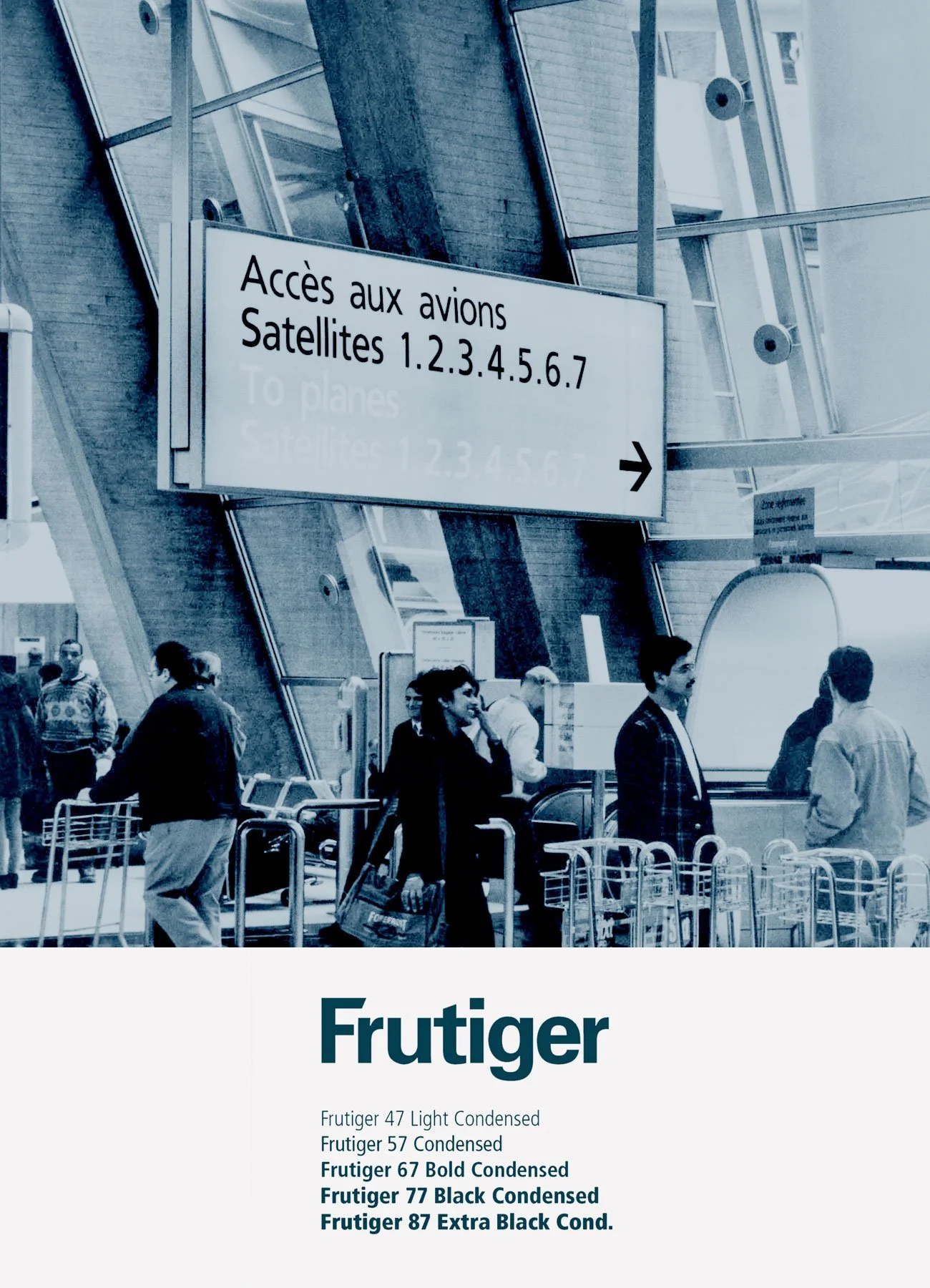
Why Frutiger Font
Frutiger is a humanist sans-serif typeface designed by Swiss type designer Adrian Frutiger in 1975, originally created for signage at Charles de Gaulle Airport. The typeface emphasizes clarity, legibility, and a modern aesthetic, making it one of the most versatile and widely used fonts available today. Here are the reasons why we chose this font:
1. High Legibility: Frutiger is designed for readability at various distances, in low light conditions, and at smaller sizes.
2. Neutral Aesthetic: Its clean and minimalist design strikes a balance between being overly formal and too casual, making it suitable for a wide range of applications.
3. Versatility: Available in multiple weights and styles, Frutiger can adapt to both print and digital mediums effectively.
Solution:
For Flight Training Adelaide (FTA), Frutiger is a strong candidate for a redesigned logo, given its alignment with the aviation industry’s need for clarity and professionalism. Its history in airport signage (e.g., Charles de Gaulle) and use by transportation-related entities make it particularly relevant for evoking the “first takeoff” experience, symbolizing precision, control, and clarity. The font’s clean lines and high legibility could create a bold, memorable logo that reflects FTA’s core mission of aviation training while distinguishing it among other Adelaide-based flight schools.
Shades of Sky: Crafting FTA’s Blue Color Palette
For Flight Training Adelaide’s (FTA) logo redesign, a blue-dominated color palette is proposed, leveraging the psychological and symbolic resonance of both dark and light blue to reflect FTA’s core values and aviation identity.
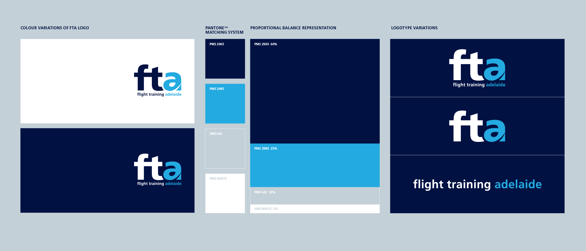
Dark blue embodies professionalism, stability, and trust, essential for a leading flight training provider serving 28 major airlines. Its deep, authoritative tone conveys intelligence, wisdom, and dependability, fostering confidence in FTA’s training expertise and creating a memorable impression.
Complementing this, light blue symbolizes the clear, open skies of Adelaide, South Australia, where favorable flying conditions with minimal weather disruptions make it a premier location for aviation training. This shade evokes calmness, reliability, and freedom, aligning with the safety and professionalism paramount in flight training while directly referencing the “first takeoff” experience, a moment of clarity and empowerment for cadets. Dark and light blue together create a cohesive palette that ties FTA’s brand to its aviation roots, strengths, and commitment to trust and excellence.
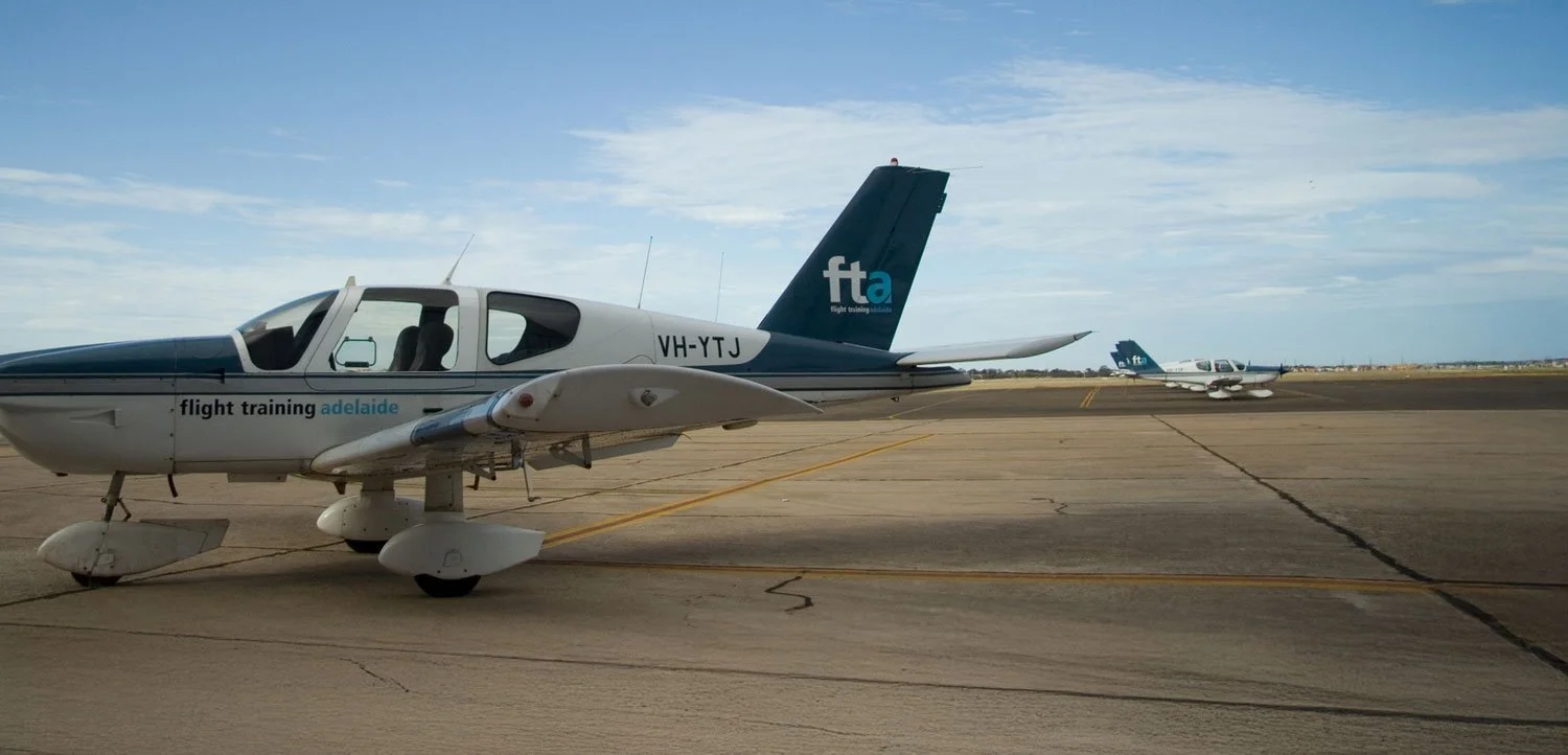
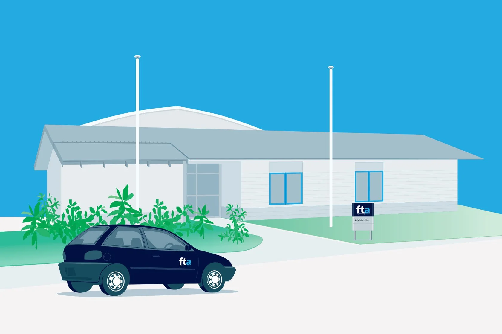
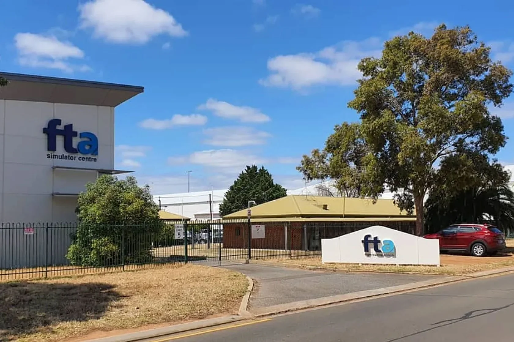
A Unified Logo Redesign Across All Touchpoints
The redesign of the FTA logo necessitates strategic adaptations across various touchpoints to ensure a cohesive brand identity that reflects the school’s mission and values.
Key Takeaways for FTA Redesign
The redesign of the FTA logo offers a valuable opportunity to enhance the school's visual identity, ensuring it remains relevant and competitive. By integrating contemporary design elements, the new logo can significantly strengthen brand recognition while staying true to FTA’s core identity. It’s essential to approach this process with strategic planning evaluating the current logo, clearly defining brand values, and allowing creativity to lead the way, all while ensuring consistency. Creating a thorough brand style guide will facilitate seamless updates across various platforms, including signage, uniforms, marketing materials, and digital media. Engaging stakeholders throughout the phased implementation and continuously monitoring the process will help guarantee a successful rollout, ultimately enhancing FTA’s professional image and fostering a deeper connection with the community.