New York Stock Exchange
UI/UX / Branding
NYSE
My Role:
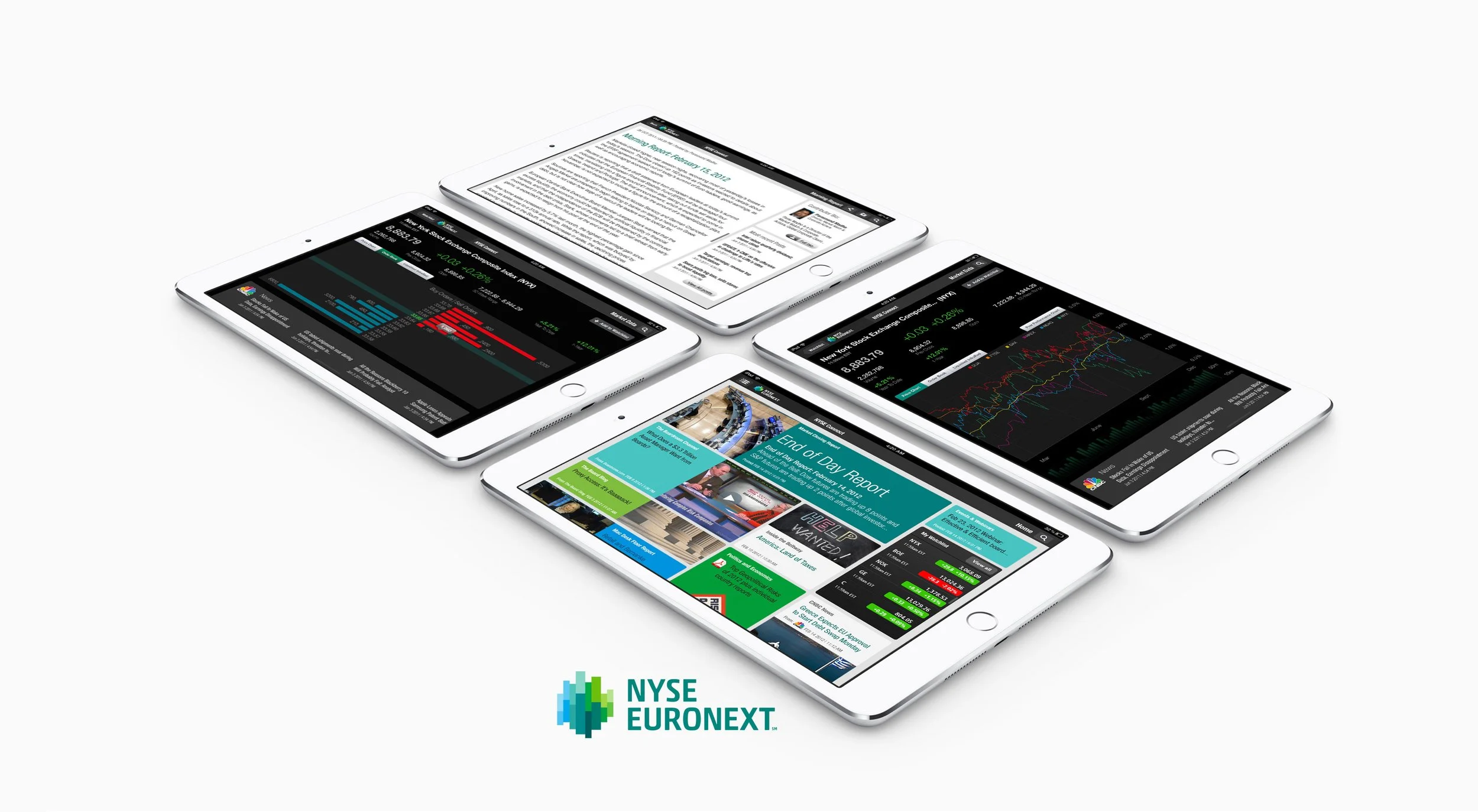
As the Associate Interaction Director, I led the Hong Kong UI/UX team in designing and developing the NYSE iPad app for the New York Stock Exchange. This innovative mobile application was created to deliver real-time market data, advanced analytics, and portfolio management tools to financial professionals. By prioritizing user needs, we crafted an intuitive and powerful interface that allowed users to monitor portfolios, access critical market insights, and sync documents offline, ensuring seamless functionality for on-the-go professionals.
What is NYSE
iPad App
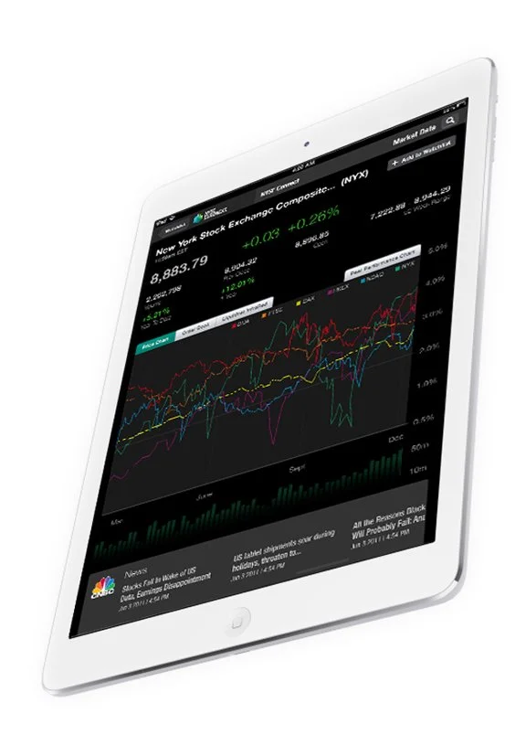
NYSE iPad app allow subscribers access to the same streaming financial market pricing data, historical pricing data, fundamental data, news, charting, analytics found through its desktop counterpart.
Keep your team ahead of dynamic markets
Empowering Wealth Creation
We envisioned empowering financial professionals to make confident decisions anywhere. It revolutionized engagement with the New York Stock Exchange, delivering real-time insights and personalized tools to drive success in fast-paced markets, inspiring smarter, bolder moves through a user-centric platform.
The Purpose (Why)
Crafting a Seamless Experience
Guided by user-centered design, we brought our vision to life through a collaborative process: immersing ourselves in financial professionals’ workflows via interviews, crafting personas for traders and analysts, iterating wireframes and prototypes for intuitive navigation, designing a clean, touch-optimized iPad UI, rigorously testing with users for a seamless experience.
The Process (How)
A Game-Changing App
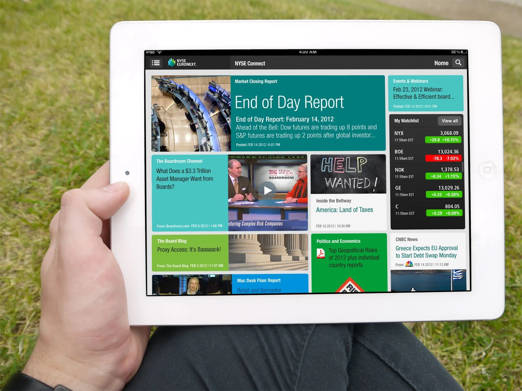
The NYSE Connect iPad app launched triumphantly, delivering a seamless, intuitive experience with real-time data, customizable dashboards, and offline syncing. It transformed portfolio management, earning praise from NYSE stakeholders and users for its streamlined navigation and robust functionality, becoming a trusted financial tool.
The Result (What)
UX/UI Process and Steps Taken
The UX/UI design process for the NYSE Connect iPad app followed a structured, iterative approach rooted in user-centered design principles.
Here are the detailed steps.
-
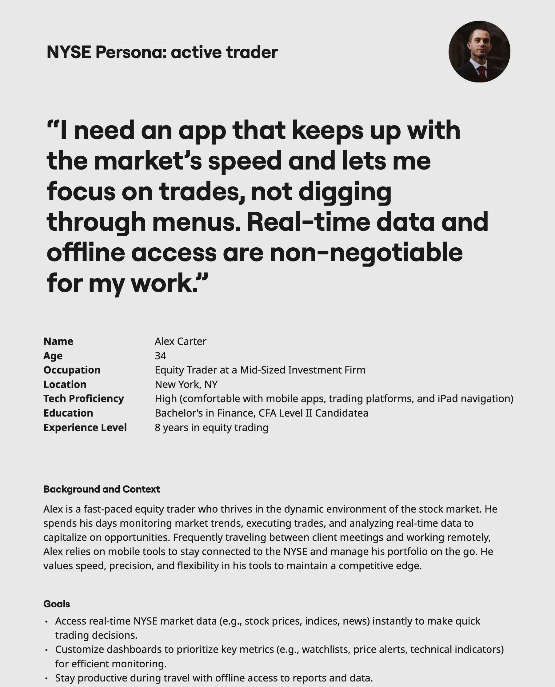
We conducted stakeholder interviews with NYSE representatives to align on goals, while performing user research through surveys and one-on-one interviews with financial professionals to pinpoint needs like real-time data access and offline functionality. We also analyzed competitors’ apps to uncover gaps and opportunities, and developed three user personas, such as “Active Trader” and “Portfolio Manager,” to steer our design decisions.
-
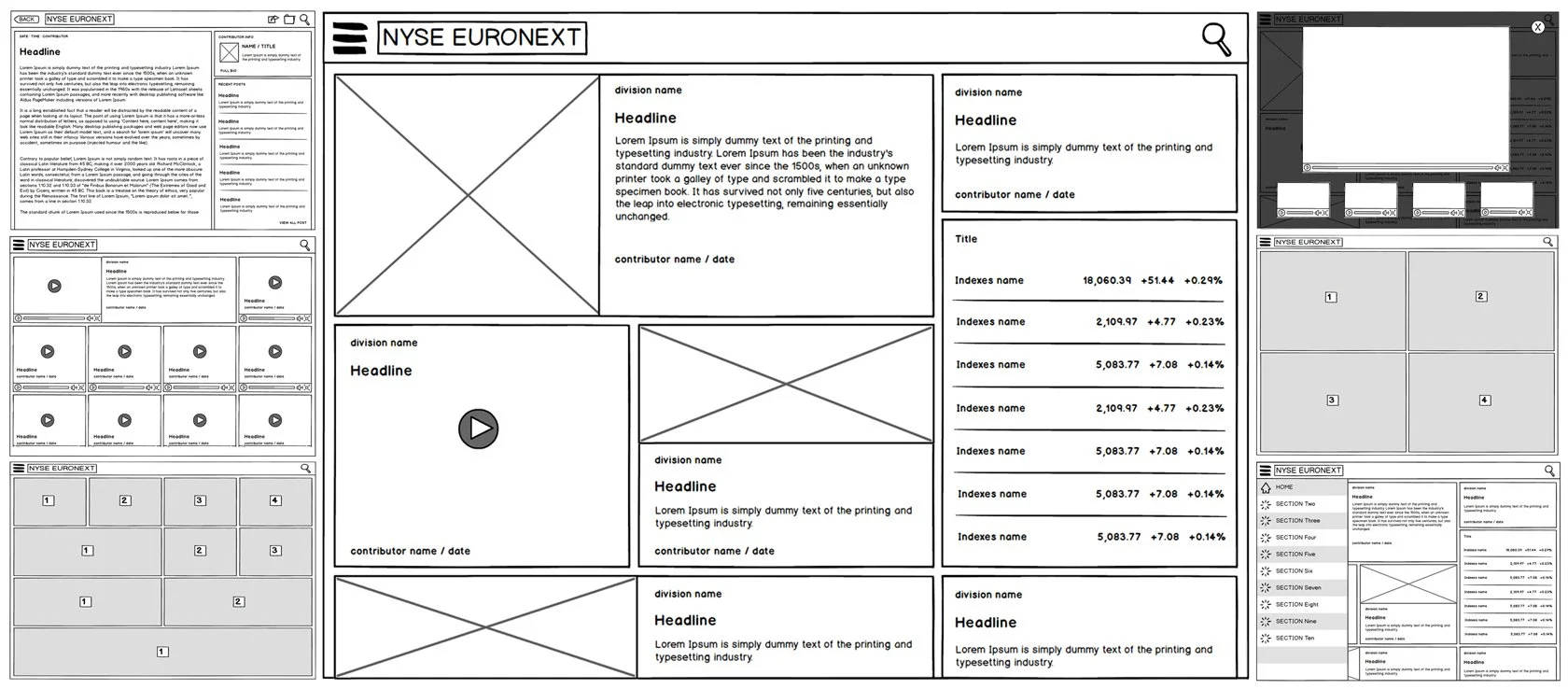
We crafted an information architecture (IA) map to structure the NYSE Connect iPad app, prioritizing key features like market data, portfolio tracking, and analytics. Low-fidelity wireframes were sketched to outline navigation flows and screen layouts, then transformed into clickable wireframes using Balsamiq for early team feedback, ensuring an intuitive foundation for the app’s design.
-
In the prototyping and iterative design phase, we built interactive prototypes using Adobe XD to simulate user interactions for the NYSE Connect iPad app. We conducted internal reviews with the Hong Kong UI/UX team to refine layouts and ensure alignment with user needs, while incorporating feedback from CarryQuote’s product managers to balance usability with technical constraints, creating a user-focused design ready for further testing.
-
We designed a clean, professional UI, emphasizing readability and touch-friendly controls while adhering to iPad’s design guidelines. A neutral color palette with high-contrast elements ensured clear presentation of financial data, complemented by custom icons and data visualizations crafted to enhance user comprehension and streamline interaction.
-
We delivered detailed design specifications, assets, and style guides to developers ensuring a smooth handoff. Close collaboration with the development team guaranteed accurate implementation of real-time data feeds and offline syncing. Final QA testing was conducted to verify UI consistency and functionality, ensuring the app met our high standards before launch.
Discovery and Research
Objective: Understand the needs and pain points of financial professionals to align the app with their real-world workflows.
Actions:
Conducted 15 in-depth interviews with traders, analysts, and portfolio managers to explore their daily tasks, such as monitoring market trends and accessing reports on the go.
Distributed surveys to 50+ NYSE users to quantify preferences, revealing that 80% prioritized real-time data and 65% needed offline access.
Analyzed competing financial apps (e.g., Bloomberg, Reuters) to identify usability gaps, such as cluttered interfaces or slow data updates.
Held workshops with NYSE stakeholders to define project goals, including brand alignment and performance metrics.
Outcome: Developed a clear understanding of user needs, summarized in a research report that guided subsequent design phases.
Information Architecture (IA) and Wireframing
Objective: Create a logical and intuitive app structure to support seamless navigation and feature accessibility.
Actions:
Mapped out the app’s IA using flowcharts to prioritize key features like real-time market data, portfolio tracking, and document management.
Sketched initial low-fidelity wireframes using pen and paper, followed by digital versions in Balsamiq to outline screen layouts and navigation flows.
Defined a hierarchical menu structure to ensure quick access to high-priority features, such as stock tickers and analytics dashboards.
Conducted internal reviews with the 7-member Hong Kong UI/UX team to validate wireframes and refine based on feedback.
Outcome: Produced a comprehensive IA and clickable wireframes that served as the foundation for prototyping, validated by team consensus.
Prototyping and Iterative Design
Objective: Test and refine interaction flows to ensure an intuitive user experience tailored to the iPad’s touch interface.
Actions:
Built interactive prototypes using InVision, simulating key interactions like dashboard customization and document annotation.
Conducted two rounds of internal usability testing with the design team to identify friction points, such as overly complex widget controls.
Iterated prototypes based on feedback, simplifying drag-and-drop functionality and reducing taps needed to access critical data.
Presented prototypes to CarryQuote product managers and NYSE stakeholders, incorporating their input on branding and feature prioritization.
Outcome: Delivered polished, interactive prototypes that aligned with user needs and stakeholder expectations, ready for user testing.
Visual Design and UI Development
Objective: Craft a visually appealing and functional interface optimized for the iPad’s touch-based environment.
Actions:
Designed a clean UI with a neutral color palette (blues and grays) to ensure readability of financial data under varying lighting conditions.
Created custom icons and data visualizations (e.g., charts, heatmaps) using Adobe Photoshop to enhance comprehension of complex market data.
Followed Apple’s iPad design guidelines, ensuring touch-friendly controls (e.g., large buttons, gesture-based navigation).
Developed a style guide specifying typography (Helvetica Neue for clarity), color schemes, and spacing to ensure consistency.
Outcome: Produced a professional, user-friendly UI that balanced aesthetic appeal with functional clarity, especially
Usability Testing and Iteration
Objective: Validate the design with real users to refine functionality and ensure a seamless experience.
Actions:
Conducted usability testing with 12 financial professionals, using moderated sessions to observe interactions with prototypes.
Collected qualitative feedback (dashboard customization feels intuitive but needs clearer save options) and quantitative data (task completion time reduced by 25% after iterations).
Identified and resolved pain points, such as simplifying the document syncing process to reduce user errors.
Iterated designs based on findings, adding visual cues like progress bars for syncing and clearer widget labels.
Outcome: Achieved a refined design with a 90% task success rate in final testing, confirming the app’s usability and readiness for development.
Results and
Impact
User Adoption: The NYSE Connect iPad app was adopted by thousands of financial professionals within the first six months, exceeding NYSE’s adoption targets.
User Satisfaction: Post-launch surveys indicated a 92% satisfaction rate, with users praising the app’s intuitive navigation and real-time data delivery.
Business Impact: Strengthened NYSE’s mobile presence, positioning it as a leader in providing accessible, high-quality financial tools.
Team Achievement: The UI/UX team received recognition from NYSE leadership for delivering a polished product under tight deadlines.
Market Edge: The app’s offline syncing and customizable dashboards set it apart from competitors, enhancing user loyalty.
